When an instructor teaches a class on Coursera, they get to make a direct impact on hundreds of thousands of learners all around the world. This broad reach is a huge attraction for teachers. But we think the benefits of teaching a MOOC can go even further. The streams of data coming in from learners can give instructors an unprecedentedly detailed view into how learning happens, where they can make improvements, and future pedagogical directions to explore.
The University Product team at Coursera develops new tools and features for our university partners. A major part of this is building windows onto these rich and complex streams of data. We take raw data from learners’ activity and, with the help of analysts and designers, shape it into a form that instructors can act on. The visualizations and metrics we present help instructors understand their learners and make informed decisions. By building user-friendly tools, we are making data a part of the everyday act of teaching.
Dashboards
This spring, we launched a “Google Analytics”-style Course Dashboard to give teaching staff a top-level view of what was going on in their courses: Who is taking my course? Where are they coming from? How are they doing? What are the trouble spots, where learners fall off track? This dashboard was received with enthusiasm. Every week, over half of our instructors stop by to check on their course’s progress.

But this first version really just skimmed the surface. To go deeper, we worked this summer on extending the dashboard into quizzes and peer assessments, giving our instructors a question-by-question and option-by-option view of a course’s interactive content. This kind of feedback is essential to instructors. It lets them find the answers to questions like: What’s easy for my learners? What’s hard? What are the common mistakes, and where should I focus my instructional attention?

As an example, take the first quiz in our founder Andrew Ng’s Machine Learning course, currently in its 8th offering. At the top of the quiz dashboard (shown above) we show a few vital stats, as well as three interactive charts showing details on overall performance. Below this lies an itemized table of the quiz’s questions, giving basic metrics on a question-by-question basis.
These stats are all pretty straightforward, but you can do a lot with them. A good first step is to sort by “First attempt average score”, so that the questions which stump learners the most float to the top. In this case, there are some clear outliers:
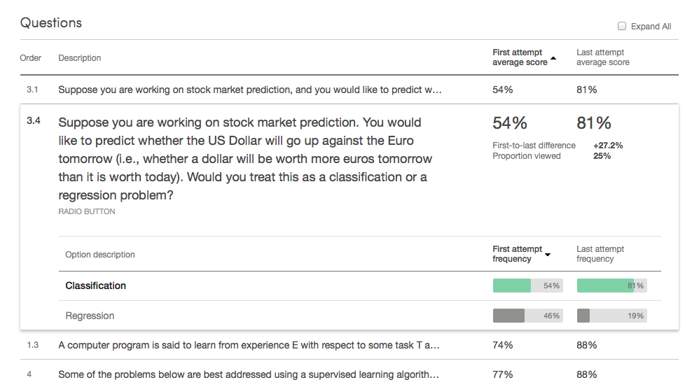
Now this is surprising! The expanded details pane shows that the first two questions have only two choices each. A 54% average means learners are performing almost as poorly as if they just chose options at random.
At this point, it’s up to the instructor to look closer. Is this level of performance what the instructor anticipated? Or is there some unexpected problem – a concept that wasn’t communicated clearly, or an incorrectly worded question? In this case, with the issue brought to his attention by the dashboard, Andrew compared these low-scoring questions to similar ones, and found that these two questions were more confusing than the rest. As a result, he went into our quiz editor and clarified these questions for the next run of his course. The dashboard will be there to check that these fixes worked, continuing the cycle of iteration and improvement.
Peer-graded assignments
The new detailed dashboard also supports peer-graded assignments. For these assignments, simple metrics of averages and counts are not sufficient. One thing we wanted to shed light on was the accuracy of submitted assignments’ final scores. We compute a final score for a submission by combining the scores that different peer evaluators give it. If these evaluators tend to agree on a score, we can be fairly confident that we’ve pinned down a good guess of the submission’s true score. But if evaluators assign varied scores to the same submission, that means that random noise is affecting the final score much more.
| Low inter-grader variability | High inter-grader variability | |
| Submission 1 | ||
| Submission 2 | ||
| Submission 3 |
For our dashboard, we use a bootstrap sampling process to simulate the scoring process. From this simulation, we compute a simple measure of the average sampling error. It tells, on average, how far the score we give a submission is from the ideal score we would give it if we had an infinite number of evaluations. For example, the low inter-grader variability submissions on the left (above) result in an average error of 6%, and the high inter-grader variability submissions on the right result in an average error of 17%.
If an instructor finds a peer-grading score item with an abnormally high average error, they might be able to reduce this error by making the scoring criteria more clear or increasing the number of peer evaluators per submission. We hope this metric will help instructors monitor the health of their course’s peer-grading systems.
Data pipeline
As anyone who has built a data-driven product knows, the engineering behind systems like this goes much deeper than a pretty interface. Here’s an overview showing the flow of data from raw production databases all the way to a dashboard user:
Production DBs
Data warehouse
(primary tables)
Data warehouse
(intermediate tables)
Report storage
The end result: Instructors have instant access to up-to-the-day metrics on every one of their quiz questions and peer assessment criteria.
Conclusion
We are very glad to be able to offer these kinds of features to our instructors, and we are excited to see what they do with them. But really, this is just the beginning. We want to do far more to pull insight-needles out of the data-haystack, directing instructors’ attention to the most important patterns and points of interest. We are also working on completing the feedback loop, by integrating dashboards and analysis tools with the authoring tools instructors use to create and edit course content. Imagine using analytics to identify a location for improvement, making a revision, and then, within days, seeing the impact of your change on learners’ success. This vision – of platforms which allow instructors to rapidly advance the effectiveness of their instruction – drives a lot of what we do here in the University Product team.
(And like the rest of Coursera, we’re growing fast. Let us know if you’re excited about the work we’re doing and think you might want to join the fun.)